When I was in school, I really liked math class. As someone generally most comfortable in the abstract and subjective world of creative writing and literature, having an outlet grounded in more absolute solutions and objectivity was a balance I appreciated, especially during times of creative block. Solving complex math equations could also feel a little like detective work or putting together a really complicated puzzle–hunting down the relationships, patterns and components necessary for the right solution.
In my career, this love has translated into my love of data and trend analysis. This is a helpful love to have as a strategic marketing and communications professional because it means I can enjoy the creative parts of production and content planning, as well as the less-creative parts of analyzing what worked, what didn’t and why. In a way, good data science can be another outlet to tell a story:
What are we tracking, and why does it matter?
What do we consider success, and why?
How does success in our marketing and communications relate to programmatic success, development success, community success, etc.?
Are there relationships between the data categories we’re tracking that we should dig into further?
Understanding why you’re tracking what you’re tracking can make the difference between simply reporting out the “required” numbers and crafting a story of impact, success and meaning. Taking data beyond “here are the numbers” to “here’s what the numbers mean” provides necessary context to understand what you’re looking at and why it matters.
Finding the Story
One of my favorite examples of this is the first report I put together for LEAP’s One and All entrepreneurship program. Because the program was grant-funded, there were specific metrics one of the grantors required us to track biannually. Because the program was focused on entrepreneurs at or below the ALICE Threshold, two of the key metrics tracked were annual household income and monthly fixed living expenses (things you have to spend money on no matter what like housing, childcare, transportation and food).
We were seeing a steady increase in household incomes following program graduation, with incomes rising an average of $10,000 per year sustained over the first one and a half years following graduation, but I realized that figure alone was telling an incomplete story. Without looking at that income increase in relation to reported monthly budget for fixed living expenses, we weren’t seeing the true story of what more money for a household means; if inelastic expenses were rising at the same, or higher, rate as income, that income increase wasn’t really translating into an improved quality of life.
So for the April 2022 report, I decided to provide extra information to better contextualize program impact, including exploring the ratio of household income spent on fixed monthly expenses. What we found was an incredible piece of the story that had never been told: that ratio was dropping consistently over time, even as inflation began to increase more rapidly, with the most dramatic decrease being in program 3 at six months after graduation. For this group, fixed monthly expenses went from taking an average of 102% of participants’ monthly income, meaning participants had to spend more money than they earned just keep themselves and their families housed and fed, to 61%.
That 41% decrease in household income spent on basic living expenses, along with the general downward trend we saw in this ratio across all programs, allowed us to see how household income increase was truly able to contribute to improved financial health and quality of life; a reduced ratio of household budget spent on the basics meant there was more money for families to save, invest in their businesses or simply engage in the enriching, joyful experiences that make life fun instead of just a game of survival.
This is a story that never could have been told without looking beyond what we had to report to become curious about what the data points actually meant in the context of real people and real households. Good data science requires continuous curiosity and often a little bit of sleuthing to figure out the pieces needed to illuminate the whole picture. Putting in that bit of extra work often leads to more interesting and impactful outcomes because it allows us to extract meaning from the numbers and trends we track.
Analyzing My Job Search
Most people tell you how exhausting the job search process is and I am also here to tell you that actively searching for work is, indeed, exhausting. To receive unemployment benefits in Michigan, you have to “certify” every other week by reporting your job search activity, which includes applications, interviews, offers and other activities like professional training and skill-building.
I went through a few iterations of tracking, because I was once again interested in information beyond what was required to report. Unemployment cares about the date you complete a “job search activity,” the company and the address, but I was also interested in job titles, industries and location more broadly. Beyond that, I was curious about overall rejection and interview rates, the maximum amount of applications I completed in one week and other things I’d been up to while unemployed.
So, because I am who I am, I thought it would be fun to aggregate everything I was interested in into a single document and then make an infographic of the big picture of my job search journey. Here’s what I looked at:
- Total applications
- Rejections
- Interviews
- Most applications in a single week
- Top job titles
- Top industries
- Geographic distribution by U.S. region
- What else I’d been up to
- Yoga classes taught
- Yoga classes taken
- Miles ran
- Miles walked with Miles
- Books read
- Sewing projects
- Trips to Menard’s
- Furniture pieces refurbished
- Rooms painted
In my first iteration of the infographic, I realized the way I was tracking interviews was skewing the story. I aggregated all interviews I had completed which, because that number included second- and third-round interviews, presented an artificially inflated percentage of applications that resulted in interviews. To correct this, I adjusted the number reported to reflect just first-round interviews, which would show more accurately the percentage of applications that resulted in an interview, and included a subheading to note the percentage of those interviews that resulted in a second interview.
Here’s the final infographic:
Click the image to enlarge
Interpreting the Results
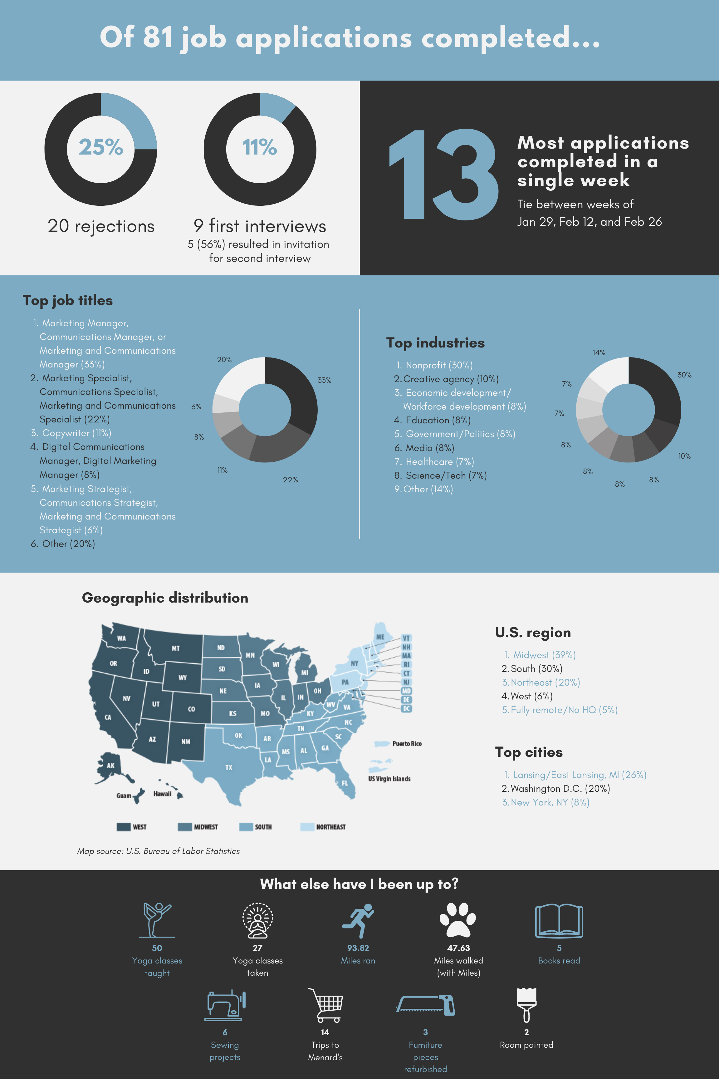
There were a lot of interesting insights that came out of this exercise (not the least of which being that I’m definitely in the right industry, considering I did this “for fun”). Of the 81 job applications I completed over 15 weeks unemployed, 25% resulted in outright rejection and 11% resulted in a first-round interview. This means 64% of all the applications I completed, or 52 applications total, resulted in no communication whatsoever. Which honestly, is pretty shitty. If you’re hiring, take the time to let people know they’re not selected so they can have closure and move on. Even if it’s just a basic form letter.
The most applications I completed in a single week was 13, a record I met the weeks of January 29, February 12 and February 26. Most applications (30%) were at nonprofits, with a significant drop to the next highest industry of creative agencies (10%). This was interesting because as much as I consider myself someone who can find meaning and excitement in any kind of industry environment, I was still really heavily leaning toward my background of nonprofit.
Similarly, most jobs I applied to (39%) were headquartered in the Midwest, with about two-thirds of those (26% of all applications) being in the Lansing/East Lansing area. The second most popular headquarters location was Washington, D.C. (20%), with many of those jobs offering an entirely remote option.
As far as job titles, I found myself leaning back into my marketing and communications background and away from programming, which was a combination of desire to get back into a more creative, storytelling-focused role and simply greater availability of options in marketing and communications versus programming. Most of my applications (33%) were for some version of manager (Marketing Manager, Communications Manager or Marketing and Communications Manager), followed by specialist (Marketing Specialist, Communications Specialist or Marketing and Communications Specialist) (22%) and copywriter (11%).
I had a ton of fun choosing the “extras” to track at the bottom of the infographic, and I think these quick stats show not just how I was spending my time, but also the activities I consider a significant interest or part of who I am. I got a lot of laughs from friends who saw I was tracking trips to Menard’s, which felt like a very uniquely Midwestern homeowner number to be interested in. It was also fun to quantify the things outside of my career that I accomplished during my hiatus from full-time work, like teaching 50(!!!) yoga classes, reestablishing a regular running routine, getting back into my reading practice and working on sewing projects.
Why Does This Matter?
There are lots of reasons why I find value in this project–not the least of which being that it quantifies just how much work goes into a job search, and just how broadly we often have to cast our net to get results. It also illuminated for me the frustrating trend in hiring practice that is ghosting applicants and leaving them wondering if your hiring process is just slow, or if you have moved on.
Additionally (I buried the lede a little here), I accepted a job offer last week! This is exciting in and of itself, but in relation to this data project, it’s interesting from the story’s standpoint. At the end of this month I’m starting as Greater Lansing Food Bank‘s Senior Manager of Marketing and Communications, which means the job I ended up accepting falls within the top categories of job title, industry and location (both regional and city) for all my applications. There’s definitely something to be said for the power of volume!
If you’re in the midst of your job search, I hope this helps you feel a little less alone in the frustration of the process. It’s easy to feel disheartened by the complete radio silence that is so often the result of your application and it’s important to remember that, most of the time, that’s not a reflection on you or your ability to do the work of the advertised job.
My advice (if you’re asking for it) is to find a way to create purpose and interest for yourself within, or outside, of your search. Find ways to explore your identity and passions outside of your career (like how I learned I’m pretty good at refinishing furniture!) and try to find ways to detach from the emotional nature of putting yourself out there, again and again, when job searching. For me, that was stepping out of the creative and persuasive energy needed to write a good cover letter, and turning to the objectivity of numbers and trends.
This project helped me appreciate the effort I was putting in more, even if I hadn’t yet received the final fruits of my labor (an accepted offer), and it gave the side of my brain that thrives on data science and interpretation an opportunity to stretch. Without realizing it, connecting with an aspect of my professional skillset that I truly missed and enjoy, I even created a new portfolio piece!
If you’re job searching now or have been recently, what strategies did you use to minimize stress throughout the process?
If you’re a data nerd like me, what’s one of your favorite projects or insights?
Let me know below!

Leave a comment